


Fitted
Fitted is a fitness responsive app that motivates people into an exercise routine that suits their level, schedule, and interests.
Final Mobile Prototype: Fitted on invision
Project Summary:
Role: UX/UI Designer (30% UX, 70% UI)
Time: October 2018 - December, 2018
Tool: Pen & Paper, Sketch, Google drawings,Invision
Background: This is more a UI design project. As much of the UX research for this project is already complete, I was primarily focus on the UI design including wireframing, layout, color, typography, imagery, icons.
Goal: Create a responsive web app where users can search and view routines, guides, daily challenges, and other information (they can do it whenever on any device). Users can also keep a schedule by adding sessions to their personal calendar, they can stay fit anywhere.
Problems: 1. Finding exercise routines that fits users’ level can be difficult, especially if users want to try something new. 2. Finding routines that fit into users’ schedule is not easy.
Solutions: This responsive web app will help people get into an exercise of their choice by holding their hand a bit and providing routines, guides, interactive examples, and info. And it will also encourage people who want to exercise get into an easy routine for physical activities. This means fitting in as little as a 5-minute routine.
Approach
My approach started from creating a user flow diagram to sort out the main structure of the app. Taking “Mobile-first” approach, I started with creating wireframes and prototypes on mobile devices first. After building wireframes from low (on paper) to high fidelity (on Sketch), I created mood board and applied more UI elements to the app. At last, I created the final UI mockups for 2+ more breakpoints (tablet, desktop).
User flow diagram
By reading the feature requirements and user stories from the project brief, I created a user flow diagram featuring four main tasks.

Low-Fidelity Wireframe & Prototype
Based on the user flow diagram, I created low-fidelity wireframes for Fitted mobile screens. Using pen and paper, I rapidly sketched out the main screens and essential functions.


Mid-fidelity Wireframes
I focused on the mobile breakpoint and transferred my wireframe from paper to Sketch, used block of contents and applied grids to all screens. UX relies heavily on grids for determining content hierarchy, and it’s only natural to continue that methodology as a UI designer. By choosing a grid for my layout solves many design problems ahead, as I was defining where design elements can and can’t be placed.


Applying UI Elements (Grayscale wireframe)
UI elements were added to each screen, I only used grey/black for the wireframes at this stage, but paid special attention to a consistent visual hierarchy throughout the whole app like spacing.


Brainstorming: Mood Board
I was brainstorming and created a few mood boards to choose the colors for Fitted. I decide to move forward with mood board 1 (yellow and black). Yellow is a color presents energy and liveliness, and it shows the concept of Fitted very well once customer open the app. I like mood board 2 as well, but comparing to mood board 1, I feel mood board 2 is more for Olympics and outdoor activities. Since Fitted is an app for users to work out flexibly - either at home or at the gym, mood board 1 is more suitable.


Define Colors
Mood board helped me decide the final color scheme and fonts. Yellow is a color that needs to be used carefully since it’s not a friendly color and can make users feel pressure. So I prefer not to mix yellow with so many colors. Below scheme is a monochromatic color scheme, dark yellow plus lighter yellow from the same hue makes it more visually pleasant. Since two yellows from the same hue are low-contrast, so I choose a dark grey as another primary color for calls to action.
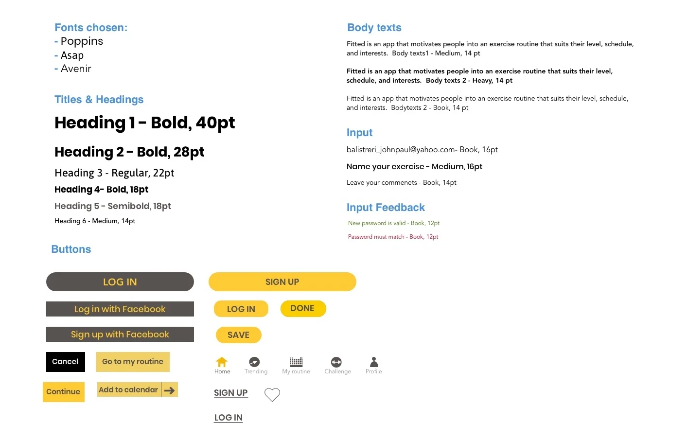
Typography
Imagery
Fitted is a product for personal fitness use. The target group is people who want to work out anytime and everywhere, and they are also able to find the levels that suit them. When choosing images, I especially pay attention to below:
1. Images showing only one person doing exercise.
2. Images showing sports that you can do anywhere- like yoga, running, jumping.
3. Images showing people doing exercise with carriable/ realistic equipment.
4. Images showing real people.

Final Mockups for Mobile


Responsive Design
I chose three different breakpoints to make the Fitted app responsive. The three breakpoints are: Mobile,Tablet and Desktop. Taking "Mobile-First" approach, I started with Mobile breakpoint, and then adapted content for larger breakpoints. I decided to design two screens: The welcome page and Home page.


