


Impression
Impression is a mobile app that helps people learn more about Impressionism art and artists, while also help them find the real art piece they can see nearby.
Final Clickable Prototype: Impression on Invision
Project Summary
Role: UX/UI Designer (50% UX, 50% UI)
Time: December 2018- January 2019
Tool: Sketch, Pen&paper, photoshop, Invision, MS Excel sheet
Goal: For people who love impressionism art, they can have all the impressionism information at their fingertips. No matter they are at museums or other places, they can look up information by image or keyword easily through this app.
Problem: As one of the most influential art movements, the information of Impressionism people can find online is all over the place. We can find them on Wikipedia and some Impressionism art related website, but there is never a place-in-one for people to directly receive the information they want. The most popular method at the moment for people to find the Impressionism art information is to search through Google, but it usually take people a while to collect the information from Google searching result.
Solution: Build an Impressionism library that contains the Impressionism art, artists and locations of the art pieces, so that people can easily obtain the information they are looking for.
My project development process is composed by 2 stages: UX stage and UI stage.
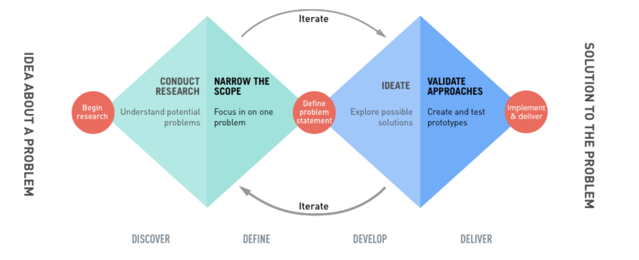
UX Approach: Double Diamond Strategy
Though this is a personal project, I would still like to follow double diamond strategy in 4 phases: Discover - Define - Develop - Deliver. Double Diamond strategy helps bring structures to the problem-solution cycle, making it easier to define problem and identify solutions. I interviews some users and created user persona to understand understand the problem first and then create a problem statement to target the solution. My target users are people who are interested in arts, museums and students who studied arts.
Step 1: Engage with Users & Understand the Problem
I started with 5 W + 1H to define the core of the product and the context of the users.
Where will users be using this product?
- On the train, in museums, in school…everywhere.
Why should users use this product?
- Help users save time looking for an art piece and there is no other better method on the market.
How will this product be used?
- Download from app store
Who are the users?
- Anyone who is interested in art, in Impressionism art, or art students.
What is this product ?
- An art library contains all Impressionism information, users can find the information of any art piece and artist.
When will users be using this product?
- When they are taking at trip, when taking classes, when talking about arts, when looking for inspiration… whenever they like.
User Interviews and User Persona
The best way to understands users is to interview user directly to gain insights of what they need, what they want, how they behave and how they feel and think. Since this is a personal project, I have already had some pain points from my personal experience. It was easy for me to come up with hypothesis and form questions to interview others to see if they feel the same, and see if my understanding is right. I interviewed a couple of friends who like arts and like visiting museums, some of my main questions include:
How do you usually search for art pieces? Does it work? If not, why not?
How do you search for a specific art piece? and how to find out who is the artist?
Why do you search for an art piece?
Do you visit museums? How do you know which art piece to see there?

Step 2: Define the problem & Synthesis
The definition stage in the Double Diamond model consists of filtering through all the information got from stage one, and elaborating on it. Based on what the users are, their goals and needs, I came up with some users stories to help me see “what users want to achieve“ from different users’ perspectives and define the product requirements.
As a person who is interested in Impressionism art, I want to be taught more about Impressionism art pieces and artist, so that i can equip myself better with my art knowledge.
As a person who likes going to museums, I want to find what Impressionism arts I can see in the museums, so that I won’t miss them when I visit.
As a person who loves arts, I want to see more arts and know about their stories, so that I don’t have to spend time search through the web to find out.
As an art student, I want to access the information of Impressionism easily, so that it will help with my school and enrich my knowledge as well.
As a person who always pays attention to art pieces, I want to be able to identify the art piece’s information, so that when I see some paintings I like I will know what is it immediately.
As a person who love explore real art pieces in daily life, I want to see what pieces i can see in my city, so that I don’t need to travel far to see them.
“How might we??”
From user stories, I tried to put everything together in a spread sheet by asking “how might we“ to measure the satisfaction of the user and also define the potential features of the app. This will also help prioritize the features and build user flows later.

Main features & App requirement:
Impressionism art pieces and they are searchable by keywords
List of Impressionism artists that is searchable
Where the arts are located and the museum information
Art of the day to inspire users and make unknown arts discoverable
Upload a picture of the art piece or take a picture of the art piece to look for related information.
Step 3: Explore the solutions and Information Architecture
I created 4 user flows reflecting these features, which are connected closely with user stories and help users achieve what they want.
By listing the user flow, the basic structure of the app became clear. I created a sitemap of the app to set the navigational base.
Step 4: Wireframing & Prototyping
Low-fidelity & Rapid prototyping
I did a rapid prototyping using pen and paper, drafted the main low-fidelity screens of the app.


2.Mid-fidelity wireframes & prototyping
I used Sketch and transfered the low-fidelity screens into Mid-fidelity. During this stage, I also specifically paid attention to the grids and layout , so later when I enrich the contents at the high- fidelity stage i will spend less time aligning the texts images.


3. High-fidelity wireframes & prototyping ( Black & Grey color scale)
I plugged images and completed the contents for the High-fidelity screens also on Sketch in black & grey color scales first.


Step 5: Polish the Design (UI phase)
MoodBoard & Typography
Since this is an app for Impressionism, my ideal color is to be closer to the Impressionism color as possible. I picked up some Impressionism pieces with vibrant colors, and defined the color pallets. Regarding the typography, since Impressionism art is from late 18th century, I used a more traditional hang writing fonts to emphasis the theme of the app.
Color Application to High-fidelity screens
I played around the color pallets that created from the moodboard and applied them to the high-fidelity screens. I used a gradient color combing green and blue on the header area meanwhile keep the rest as minimal as possible. I also applied different colors on museums (light green) and artists(purple), they are clicked links and users can be led to the related page directly.


Onboarding screens design
I chose to design onboarding screens in the end because when the app is completed and color is defined, it’s easier to match the styles and explain the app better. This is a simple app for users to use so there is no need for a complicated onboarding guidance. I just highlighted the feature of the app, and kept the wordings as simple as possible to make users feel comfortable and wanted to keep going.
Step 6: Test the prototype & Iterate
I was really curious to see how people react when the prototype is done. Since I understands the app from they very beginning and I would like to see if others users understand it as well and have no issues navigating within the app. I sent over the invision link to a couple of friends who I know that are interested in arts and going to museums.
What to test?
I asked the participants to perform the 4 main user tasks I created at the user flow stage, since they are the main goals of this app.
Revision after test:
“Search an image”
I didn’t expect that users didn’t know where is the exact search button when I asked them to search for an image. Because at the bottom navigation bar I also have a “search“ button (which is actually for users to upload image to identify the information). So I changed the name to “Upload“ to emphasize the search bar on top of the screen.

2. App introduction for Flash screen and Onboarding
It’s interesting to find out that if i don’t explain the app upfront in details, a few people looked at the onboarding and say “what art this is about?” “what is impression related to impressionism?” “How do I know this is for impressionism art?” “What if I dont know what is impressionism but I want to learn about it?” So i decided to clarify the information on the Flash screen and onboarding screens to ensure users know what this app is really about after downloading them to the phone.

3. “where am I?” - Details makes a huge difference
One user was confused where he was at since I didn’t pay attention to reflect the top header area. According to Human Interface Guideline, IOS users are used to be told where they are at from the top header indication, but I didn’t indicate it clearly and one user was lost. So I changed the wording and to ensure all indications show where users are and keep the wording consistent.


